In 2019, I started designing for GPR Material.
A special and comprehensive project of a product that makes an impact.
Before I tell you something about the case, it might be nice to tell you what GPR Material is.
GPR Material is one of the products of GPR Software (part of W/E Adviseurs). It is online software applied for environmentally friendly building and is intended for architects, developers, municipalities and corporations.
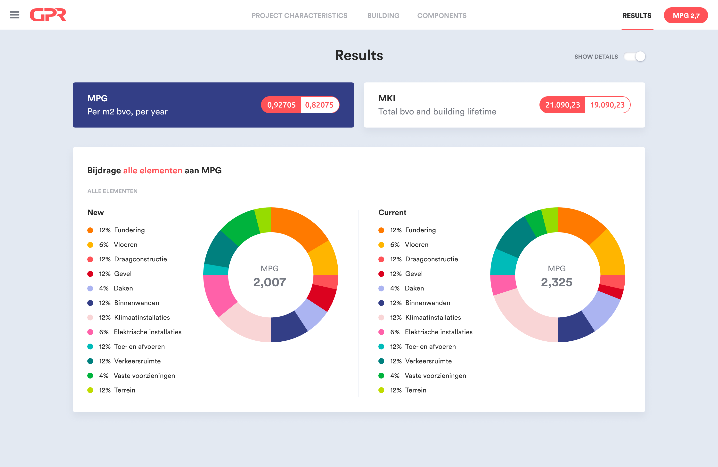
GPR Material allows you to make Environmental Performance of Buildings (MPG) calculations by composing and modifying building materials. The results of these calculations can be used to apply for building permits and subsidies.
The first version of GPR Material was called GPR Building Code. The software was not very easy to use and lacked an attractive design.
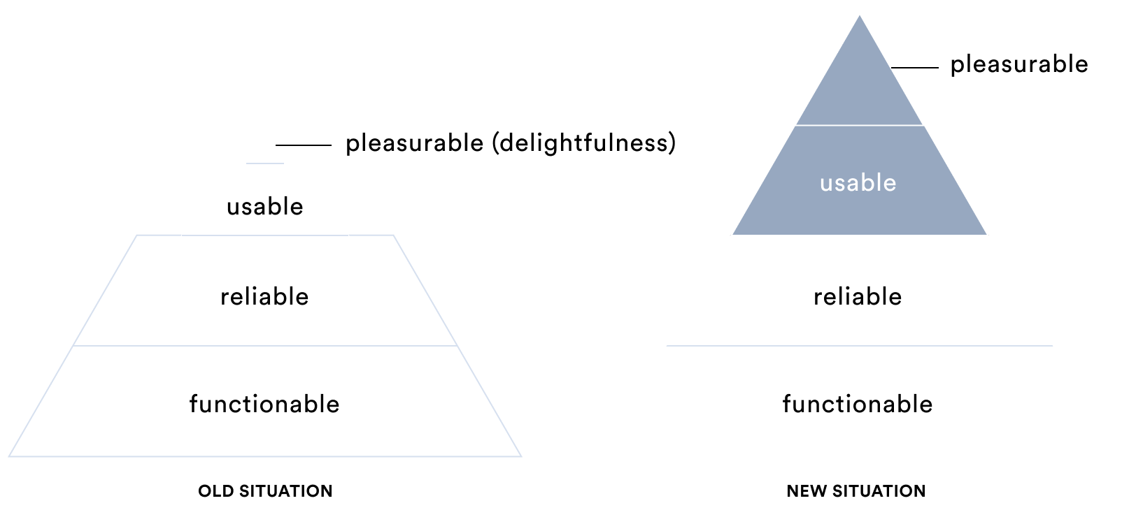
To attract new users and strengthen the product's position in the market, something had to be done: Both usability and delightfulness had to be improved.
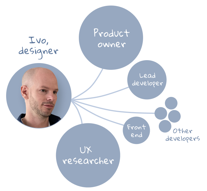
To manage the project, a Scrum approach was chosen, with a Scrum Master and a Product Owner. I worked a lot with the Product Owner and a UX researcher. I also worked closely with the lead developer and a front end developer, for a good alignment of design and technology.
To achieve quick results, and to make good use of feedback, we chose an iterative process. So the sequence of steps can sometimes get mixed up. The design process looked as follows:

Before we began the project, I discussed with GPR Software a number of things I wanted to know, including: objective(s), target audience, proposition, tone of voice, experience and values.
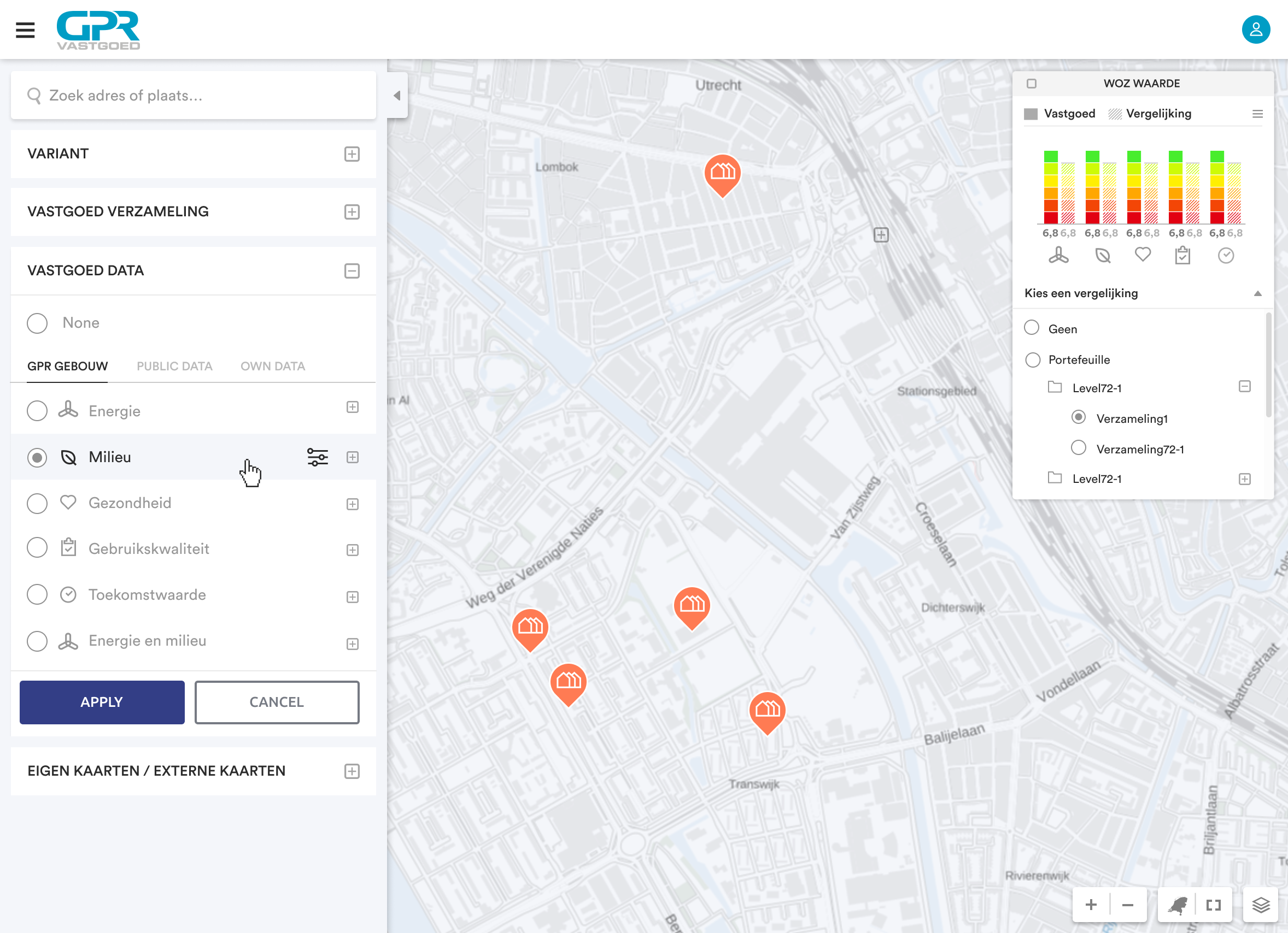
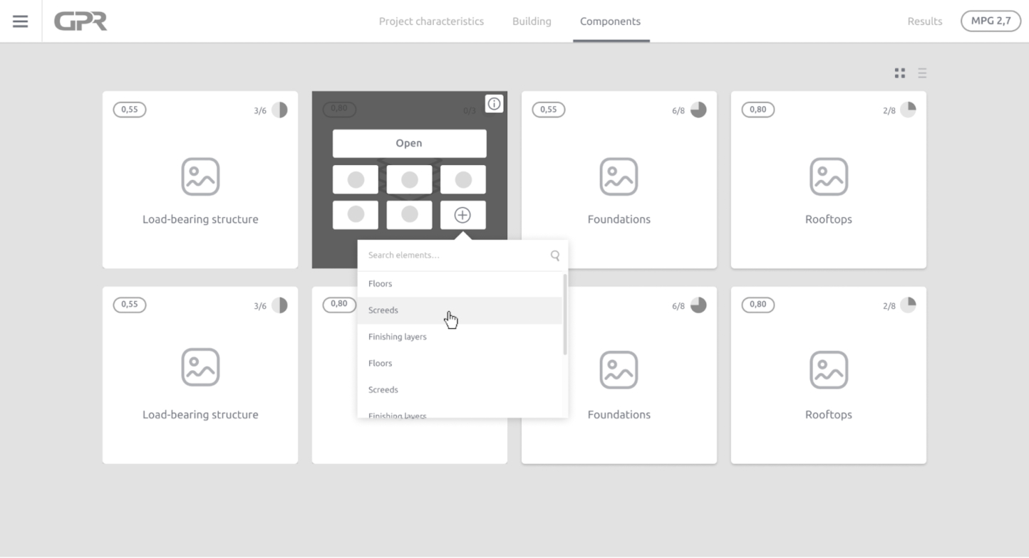
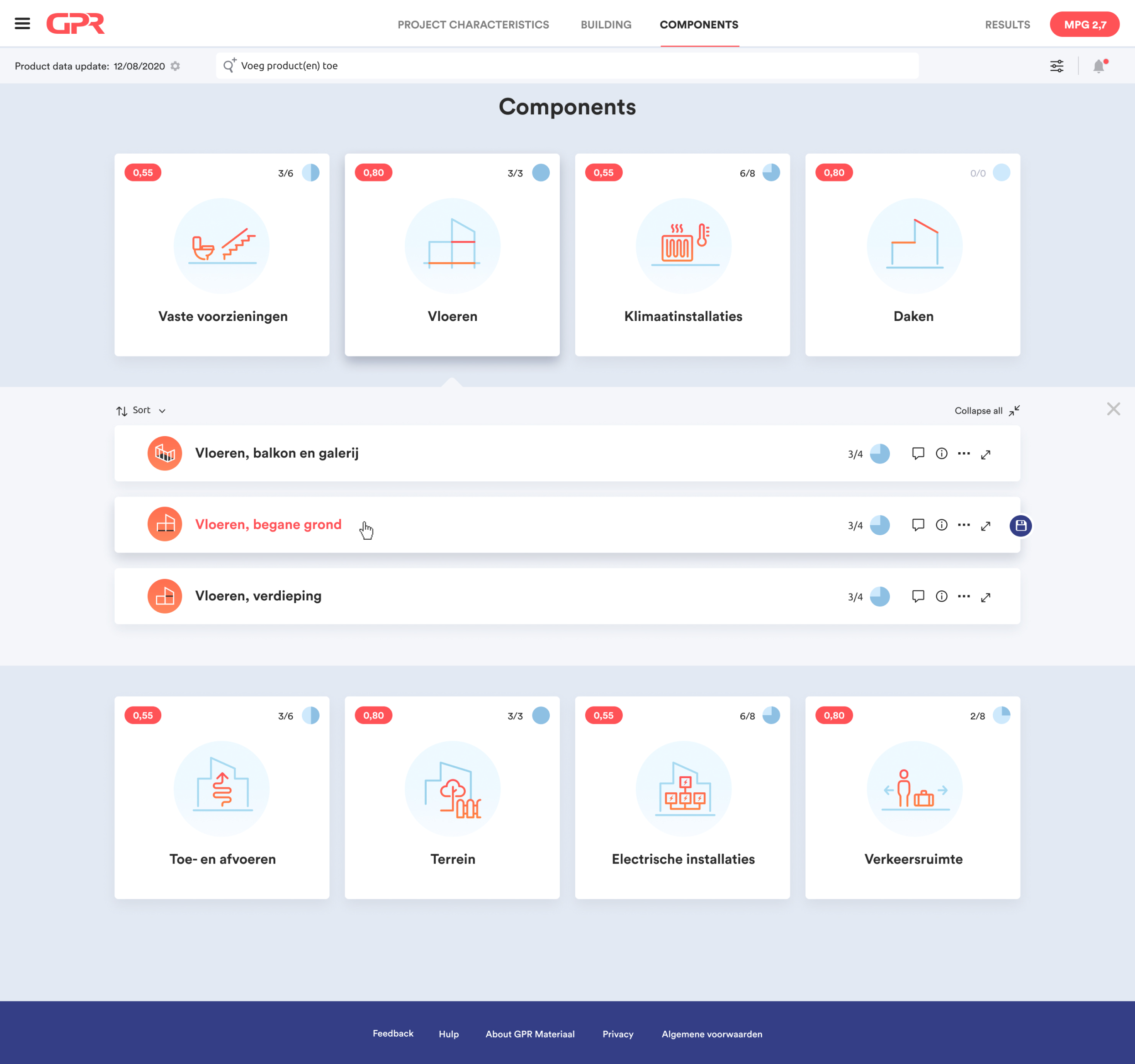
Together with the UX researcher, a number of interviews were done with users and a customer journey was created. Some improvements we made based on user research include a search field at the top of the screen and in addition to a tile view, also a list view.
I also created a prototype during the process. With this, the end user was given assignments and based on the results we made choices.
Together with the Product Owner, we created a user flow and some low fidelity wireframes.
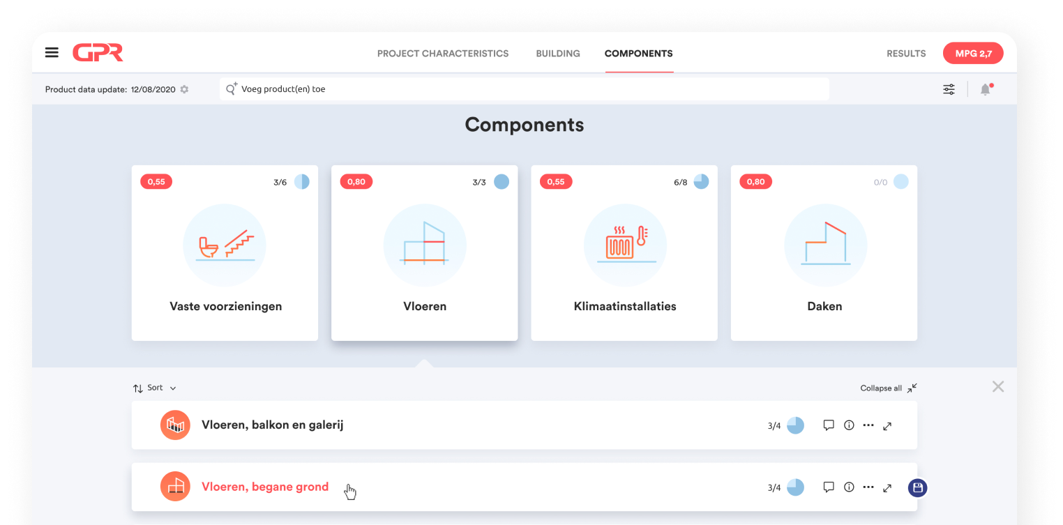
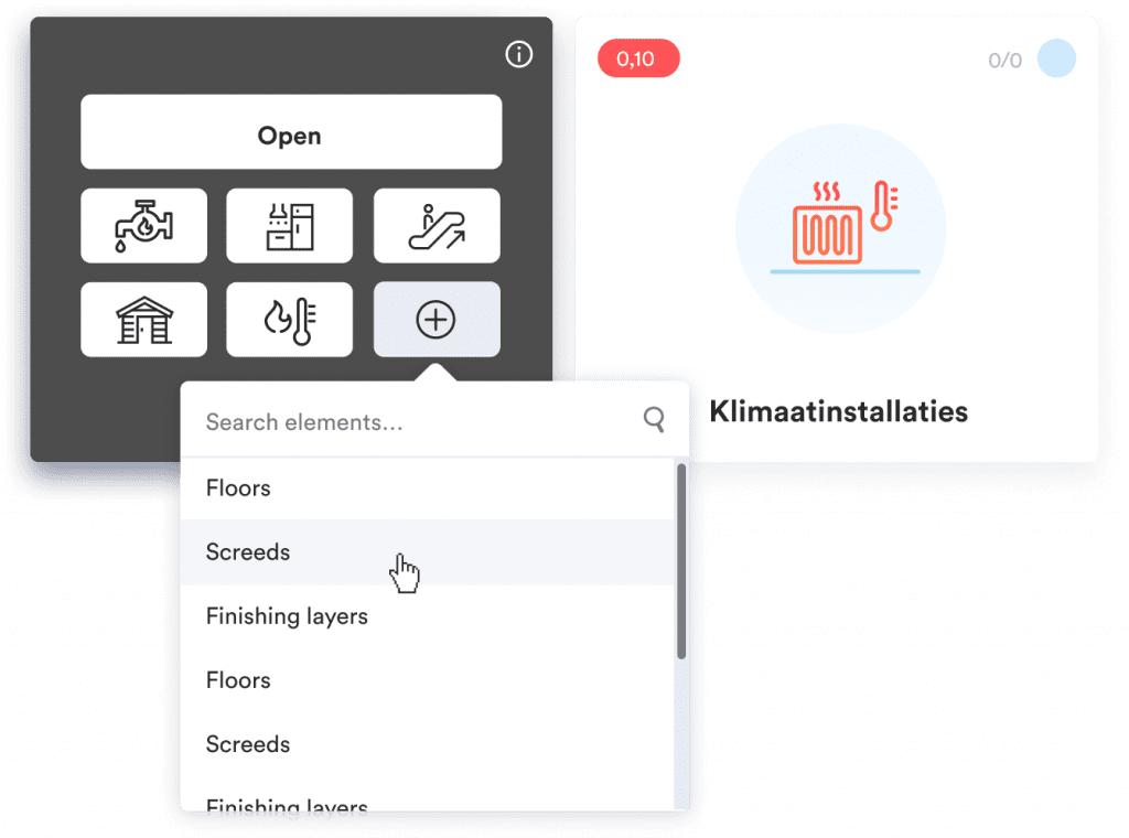
Based on these low fidelity wireframes, I designed more detailed, "high fidelity" wireframes that developers could work with immediately. This way they didn't have to wait for the elaborate UI designs.
In these designs, I thought about the precise positioning of elements such as buttons, fields and icons.
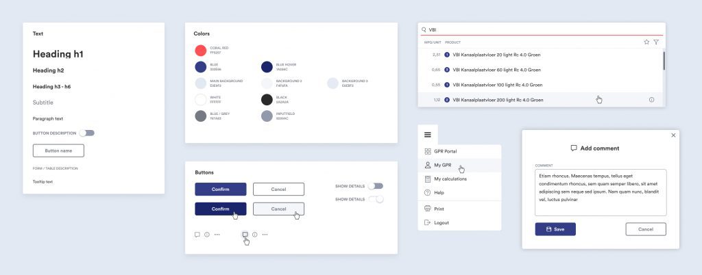
In this phase, I establish the style of the product. Consider determining color, typography and style elements.
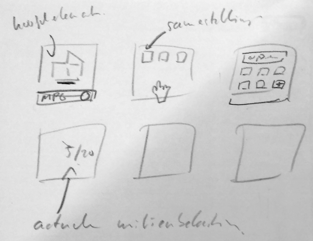
Before I start designing on my laptop, I like to "get off the screen" for a while. I made sketches and brainstormed with the Product Owner. Then I made a mood board.
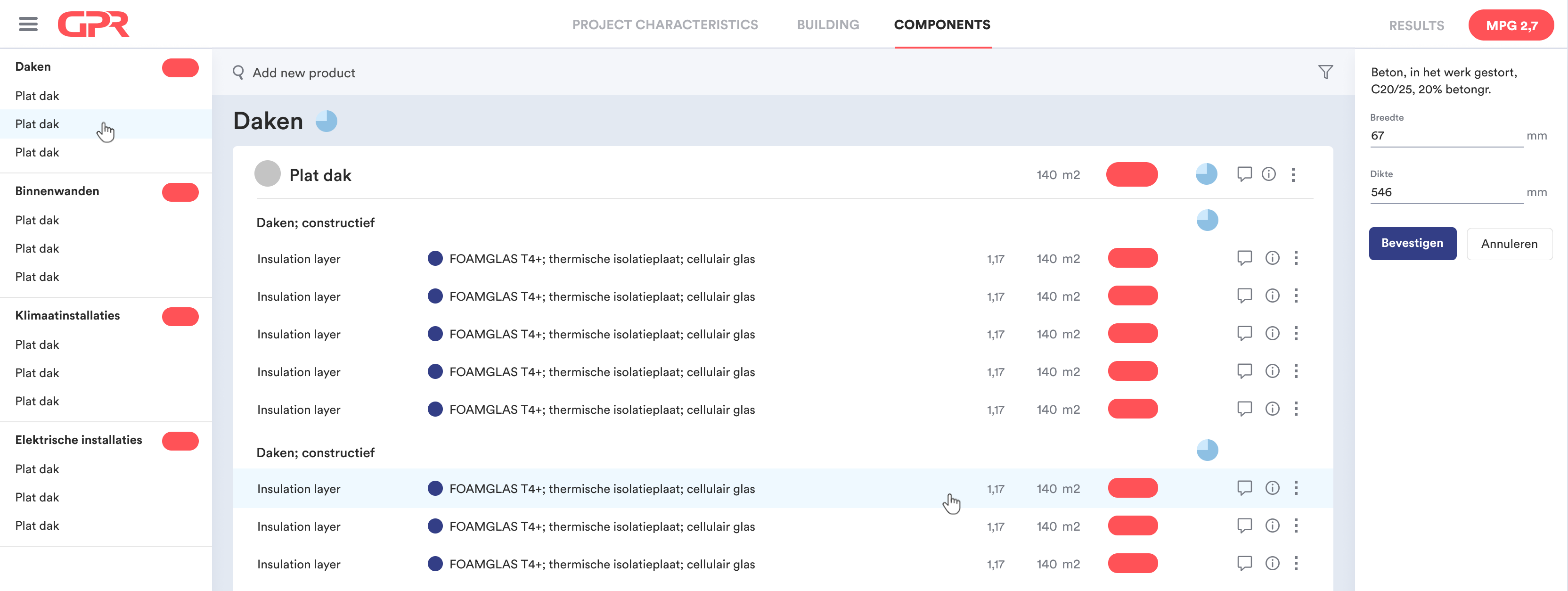
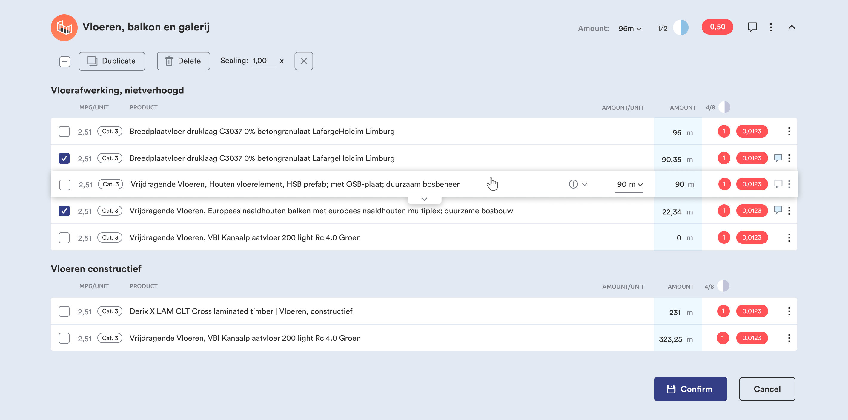
I had chosen friendly, 'engaging' colors: Mainly neutral light blue tones and 'warm' coral red as a signal color. This color stands out nicely and is important for showing the MPG score. This score should stand out everywhere.
For the typography, I had chosen Circular. A geometric, modern and easy to read font, matching the style. The rounded corners in the elements make the design friendly and approachable.
Basically, we use Google Material, but with our own "skin. Google Material elements such as transition animations and forms are also incorporated into the design.
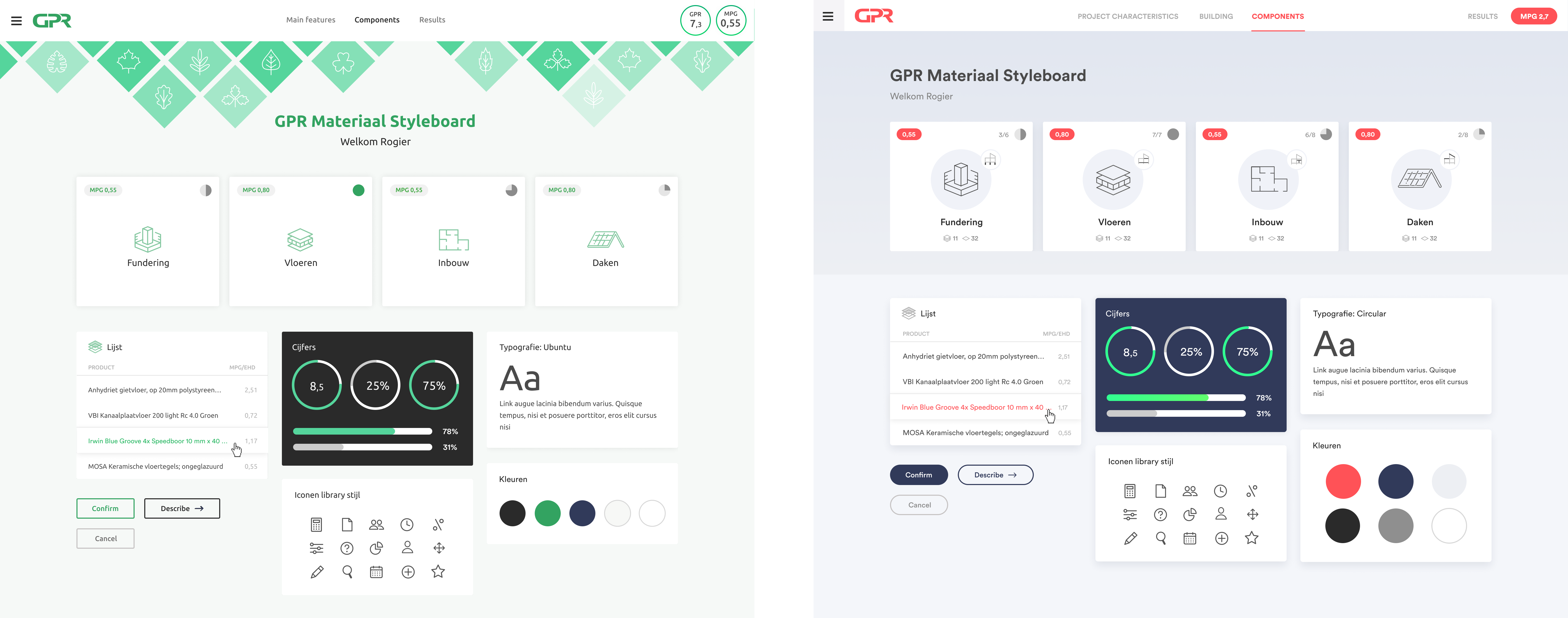
Based on the styleboard, I turned the wireframes into a visual design.
Initially, I mainly used Sketch as a design tool and InVision for design sharing and prototyping. Later, I switched to Figma. This had the advantage of smoother collaboration and transfer with developers. In addition, it allowed me to create prototypes faster and easier.
To ensure consistent application of design elements, I developed a design system for the team to use.
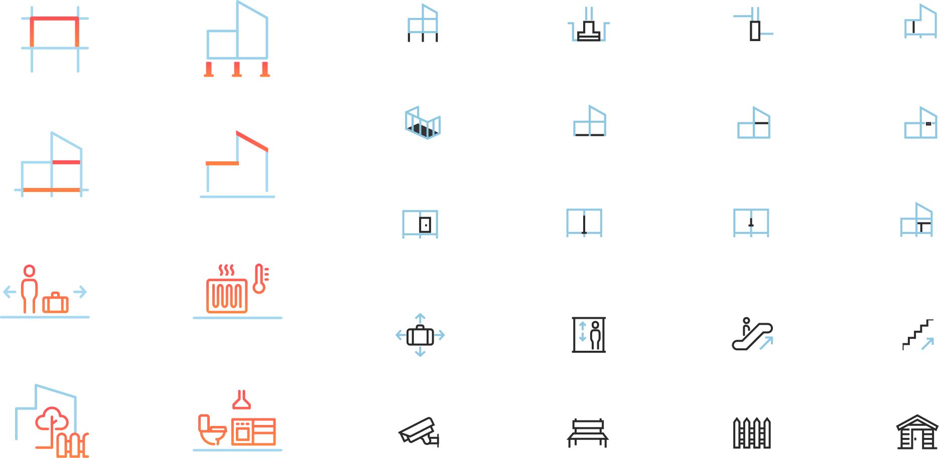
An important part of the interface are the icons. I designed a complete set for this purpose. Obviously, the icons had to be as recognizable as possible. To be sure of this, we validated the icons with users.
Several times I've used Jakob Nielsen's '10 Usability Heuristics for User Interface Design' as a design check. These 'usability heuristics' are 10 general principles for interaction design. Highly recommended for designers!
In addition to GPR Material, I've also been involved in the following projects as a designer: